Remember the old days when we pretended we had What-You-See-Is-What-You-Get? Right now I'm writing this blog on the Telerik-editor built into DNN and it's terrible.
There are a zillion bugs - like hitting backspace at the beginning of a paragraph will reformat my text (no joke). I had forgotten how bad it is, because we barely use the WYSIWYG nowadays - and you too will soon stop using it. If we're totally honest with ourselves, it never worked - and now it's clear that it never will work.
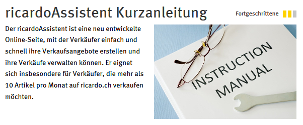
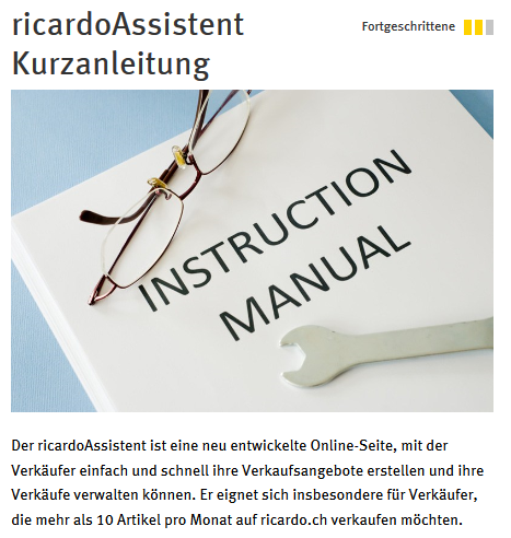
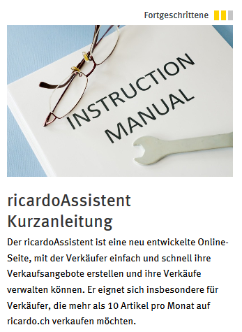
100 Previews
These pictures show the very same content - in 3 of over 100 different previews that would be possible:
The reason is very, very simple: When A4-paper was the final destination of our work at the computer, the goal was to show the resulting paper on the screen - eliminating the guesswork of what we get when we print. So WYSIWYG meant simulating paper on a PC while the editor added content (texts, images, etc.) so that ever move would look like it's being done on paper. This is simply not possible when creating responsive content - as it will look different everywhere.
Preview would also need to show behavior
Ideally it will not just look but also behave. Something that you can't See before you Get it. Touch/Click is not the same thing, and forget mouse-over in a mobile device. But even if reduced to layout-behavior - you're stuck. Let's just review the options where the image could go when screens vary:
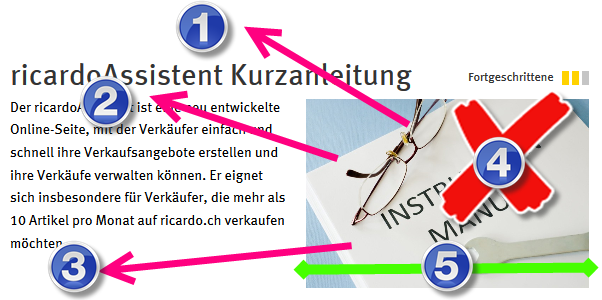
- The image could go above the title (which it actually does after a while)
- The image could go between title & text (which it also does for a while)
- It could go under the text
- We could remove it
- The size could change
- It could become super-tiny with a click to view (not shown)
- It could be replaced with an icon with a click to view (not shown)
- ...or a combination of these (very, very common)
This is impossible to preview, and even harder to configure - especially in a tool that tries to simulate a paper-simulator.
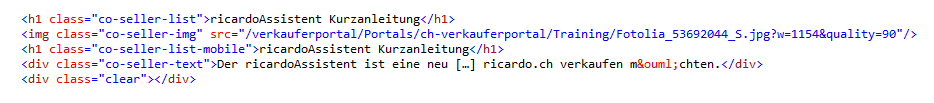
Preview is impossible, Code is absurd
Writing the correct code is even harder. Here's the code for the bit above, most of the text was removed to make it easier:
And here the annotated version
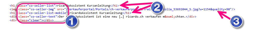
- special classes to ensure correct display-behavior based on various rules/screens
- some content inserted more than once
- special resizing-parameters
A normal editing person simply cannot do this - and shouldn't! And the WYSIWYG-Tool can't handle this - and shouldn't.
Here a few links from a current project that show some responsive behavior (open the link and try various screen sizes).
- a classic list with images which looks different on every screen size
- an overview page with content that can be 2-column or 1-column
- here is a before-after widget that must change behavior based on the situation
- this content-rotator hides some information if the screen gets too small
Redefining the Mission of the Editing Interface
So let's redefine the mission of an editing interface to match future needs: We need a UI to add content to a system, in such a way that the system can then present it to the user as best fits the user's situation (device, capabilities and context). I love bullet points, so let's just repeat that:
- UI for the editor to add content...
- ...to a Content-Management-System
- ...so that the Content-Management-System can show the content to a user...
- ...optimized to the user's device, capabilities and context
I would love to write more about context, but will reserve that for another blog. What I would like to emphasize is that it's not the editors responsibility to show the content in a designed fashion but the responsibility of the CMS. A lot of work wasted by the editor is now for the CMS to do.
- Show the full text or the intro? Let the system/web designer decide.
- Show a large image or just a thumbnail? Let the system/web designer decide.
- Image to the right or above the text? Let the system/web designer decide.
- Resolution of the image? Let the system/web designer decide.
The content-editor clearly lost many of his responsibilities. The things an editor must do in the future don't need a WYSIWYG any more. It's actually important that he doesn't believe he's seeing what he gets.
What must an Editor-UI do in the future?
- Divide an Conquer: The CMS of today needs information split into it's smallest parts, so that it can use it as best as possible. The title of an image can never again be mixed in the same "field" of data (like with a WYSIWYG) because that would limit the CMSs abilities to optimize presentation. This way the CMS will also be able to hide information if appropriate, present it in an overlay or pass the information to another sub-system like an on-device calendar or mapping-tool.
- Semantics - understand the Content-Type: The UIs must know what kind of information the editor is adding - to correctly offer him the right fields. Are you adding an image? offer 2-3 fields for that. Add a gallery-item? needs a few more fields. An address? 20 fields.
- Choose presentation: Although the editor cannot define how the content is presented (what HTML, CSS, etc.) the editor still wants to control which presentation is used for his content (I want to show the image to the right of my text if possible and not to the left...). The UI must allow the editor to choose this.
Yes, we still need editors for formatted text
...but not because it shows us how the result will look. We need it, because parts of what we write still needs features like emphasis with bold/italic or because we need inline-references (links) to other information. But that's the entire scope. Many of the things we could do in a WYSIWYG will go away.
These WYSIWYG-features will die
- Inline images and all the necessary features for alignment and such
- Font-definitions - this always was bad practice, and now it's really time to go
- Tables - also something than barely ever worked - the CMS must "know" more about what it's showing, so a WYSIWYG-table is a no-go
- Inline videos
- HTML-templates (a popular workaround to get some consistent look in the WYSIWYG) - obsolete
Where can we find such editors today?
There is of course the competition - for example, drupal and umbraco are pursuing such an approach. Within the DNN-environment I believe the only real tool for this is 2SexyContent (disclaimer: we created this). You could also do some of this with XMod or Form and List - but it would be a lot of work and not deliver a satisfying user experience. This is actually one of the core reasons we started with 2SexyContent 2 years ago - there just was no other solution for this.
...to be continued...
With Love from Switzerland
Daniel