#1 2sxc Toolbar Customization
2sxc Toolbar Customization
Since you can do so many things customizing the toolbar, we created a bunch of small examples for you. Note that we are basically providing a list of commands how the toolbar should be modified.
Important: Normally only editors see these toolbars, so clicking on the buttons won't work, except for the ellipsis (…).
The toolbars would usually only appear on hover, but the Tutorial runs in Demo-Mode so you can see them right away. The old samples still only work on hover.
Hover over the various boxes to see the result - like this:
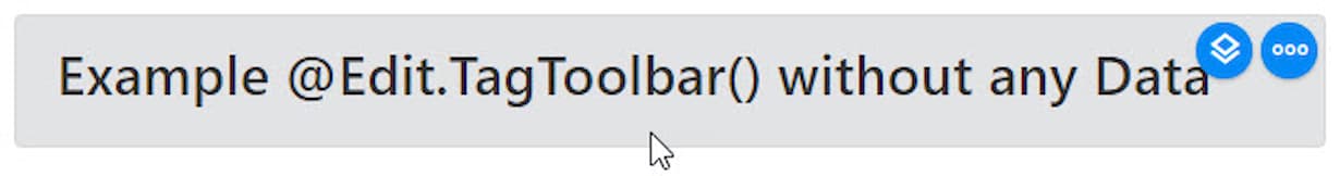
Basic Toolbars Without Special Configuration
@inherits Custom.Hybrid.Razor12
<div class="alert alert-light"
  @Edit.TagToolbar(Content, toolbar: new[] { "+edit", "+new"})>
  <h3>Add two buttons </h3>
</div>
⬇️ Result | Source ➡️
Add new button with colors
@inherits Custom.Hybrid.Razor12
<div class="alert alert-light"
  @Edit.TagToolbar(Content, toolbar: new[]
    { "+new&color=pink,black"}
  )>
<h3>Add <code>new</code> button with colors </h3>
</div>
⬇️ Result | Source ➡️
Add new
at the end of button-list
@inherits Custom.Hybrid.Razor12
<div class="alert alert-light"
@Edit.TagToolbar(Content, toolbar: new[]
  { "+new&pos=-1"}
)>
  <h3>Add <code>new</code>
  at the end of button-list
</h3>
</div>
@inherits Custom.Hybrid.Razor12
<div class="alert alert-light"
   @Edit.TagToolbar(Content, toolbar: new[] { "-more" })>
  <h3>Remove <code>more</code> button</h3>
</div>
⬇️ Result | Source ➡️
Use empty toolbar template and add
edit
@inherits Custom.Hybrid.Razor12
<div class="alert alert-light"
  @Edit.TagToolbar(Content, toolbar: new[]
   { "toolbar=empty", "+edit"}
  )>
  <h3>Use empty toolbar template and add
    <code>edit</code>
  </h3>
</div>
Add Buttons with SVG Icons (v14.08+)
We've introduced a new feature to allow custom SVG icons for buttons.
Modify a button
When we modify a button, we don't add one, but change the look or behavior of an existing button.
@inherits Custom.Hybrid.Razor12
<div class="alert alert-light"
  @Edit.TagToolbar(Content, toolbar: new[]
    { "%edit&color=red"}
  )>
  <h3>Edit button is now red</h3>
</div>
⬇️ Result | Source ➡️
New BlogPost is red,
Category is green
@inherits Custom.Hybrid.Razor12
<div class="alert alert-light"
  @Edit.TagToolbar(Content, toolbar: new[] {
  "+new&color=red&title=Blog-Post?contentType=BlogPost",
  "+new&color=green&title=Category?contentType=Category",
})>
  <h3>New <code>BlogPost</code> is red,
    <code>Category</code> is green
  </h3>
</div>
⬇️ Result | Source ➡️
Always show Delete
Note that you'll have to hit the
ellipsis a few times to see it.
@inherits Custom.Hybrid.Razor12

<div class="alert alert-light"
  @Edit.TagToolbar(Content, toolbar: new[] { "%delete&show=true"})>
  <h3>Always show <code>Delete</code></h3>
  <p>Note that you'll have to hit the
    ellipsis a few times to see it.
  </p>
</div>
Ways to provide the ui, parameters, prefill
Most buttons can have a ui and a parameters parameter. Some also have a prefill. In simple cases you will just use a string to configure this, but in more advanced cases it's easier to use an object.
Objects and strings can also be merged with other objects and strings. A good reason to do this is to prepare a complex ui/parameters/prefill object, and then use it in a loop where you may want small differences in the buttons of each toolbar.
Note that all the following examples use the ui parameter as it's easy to see the effect. But the behavior is the same for parameters and prefill.
Data Buttons with Filters
Data buttons open the management view with a list of items to manage. You will often want to filter what to open - like only open items which have a certain property or have one of 3 tags.
Important: These samples show how to do it, but it won't work in anonymous mode. To see it in full action, you will need to install the tutorial and test it logged in as Admin.
⬇️ Result | Source ➡️
Add a button-group just for my buttons
@inherits Custom.Hybrid.Razor12
<div class="alert alert-light"
  @Edit.TagToolbar(Content, toolbar: new[] {
  "+group=my",
  "+new&group=my&color=red&title=Blog-Post?contentType=BlogPost",
  "+new&group=my&color=green&title=Category?contentType=Category",
})>
  <h3>Add a button-group just for my buttons</h3>
</div>
⬇️ Result | Source ➡️
Old syntax: Add two button-groups
@inherits Custom.Hybrid.Razor12
<div class="alert alert-light"
  @Edit.TagToolbar(Content, toolbar: new[] {
  "+group=my1",
  "+new&group=my1&color=red&title=Blog-Post?contentType=BlogPost",
  "+group=my2",
  "+new&group=my2&color=green&title=Category?contentType=Category",
})>
  <h3>Old syntax: Add two button-groups</h3>
</div>
@inherits Custom.Hybrid.Razor12
<div class="alert alert-light"
  @Edit.TagToolbar(Content, toolbar: new[] {
  "settings&hover=left",
})>
  <h3>Hover Left</h3>
</div>
⬇️ Result | Source ➡️
Old syntax: Hover Left and
more button to the right
@inherits Custom.Hybrid.Razor12
<div class="alert alert-light"
  @Edit.TagToolbar(Content, toolbar: new[] {
  "settings&hover=left&autoAddMore=end",
})>
  <h3>Old syntax: Hover Left and
    <code>more</code> button to the right
  </h3>
</div>
@inherits Custom.Hybrid.Razor12
<div class="alert alert-light"
  @Edit.TagToolbar(Content, toolbar: new[] {
  "custom&title=Show%20Message?call=showMsg1",
})>
  <h3>Just call <code>showMsg1()</code></h3>
</div>

<script>
  function showMsg1() {
    alert('hello from my button!');
  }
</script>
⬇️ Result | Source ➡️
Just call showMsg2()
and use the parameter id=42
@inherits Custom.Hybrid.Razor12
<div class="alert alert-light"
  @Edit.TagToolbar(Content, toolbar: new[] {
  "custom&title=Show%20Message?call=showMsg2&id=42",
})>
  <h3>Just call <code>showMsg2()</code>
    and use the parameter <code>id=42</code>
  </h3>
</div>

<script>
  function showMsg2(context, event) {
    console.log(context, event);
    alert('hello from my Message - got this id:'
    + context.button.command.params.id);
  }
</script>
#1 2sxc Toolbar Customization