Home  ›  Blog

Customize In-Page Toolbars (new 2sxc 8.6)

Maybe you want to hover the toolbar on the left side, or you want to align the "..." more button differently. Maybe you need Left-To-Right-support, or you just want to add custom CSS classes. 

The ability to customize the edit UX was added in 2sxc 8.6. Here are the settings you can configure at toolbar-level (technical details in the wiki):

  1. hover position (right is default, but you can also hover left or force-not-hover)
  2. show behavior, because by default (if inside an area with the class sc-element) it will always require a hover. But if you create an admin-dashboard or something, you may want to always show it.
  3. placement of the "..." (more) button - because when left-aligning a menu or when not-floating it, the position to the right is kind of annoying. 
  4. custom CSS classes for whatever reason / decoration you want to apply. This will be applied to the <ul> tag which contains the buttons.

Let's look at some examples (you can find them in the tutorial-app): 
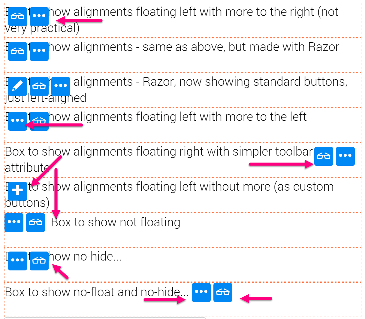
Toolbar alignments, floats and more-buttons

<div class="demobox sc-element">
    Box to show alignments floating left with more to the right (not very practical)
    <ul class="sc-menu" toolbar='' settings='{ "hover": "left" }'></ul>
</div>

<div class="demobox sc-element">
    Box to show alignments - same as above, but made with Razor
    @Edit.Toolbar(Content, toolbar: new {}, settings: new { hover = "left" })
</div>

<div class="demobox sc-element">
    Box to show alignments - Razor, now showing standard buttons, just left-aligned
    @Edit.Toolbar(Content, settings: new { hover = "left" })
</div>

<div class="demobox sc-element">
    Box to show alignments floating left with more to the left
    <ul class="sc-menu" toolbar='' settings='{ "hover": "left", "autoAddMore": "left" }'></ul>
</div>

<div class="demobox sc-element">
    Box to show alignments floating right with simpler toolbar-attribute
    <ul class="sc-menu" toolbar='' settings='{ "hover": "right" }'></ul>
</div>

<div class="demobox sc-element">
    Box to show alignments floating left without more (as custom buttons)
    <ul class="sc-menu" toolbar='[{ "action": "new", "contentType": "Dummy" }]' settings='{ "hover": "left" }'></ul>
</div>

<div class="demobox sc-element">
    <ul class="sc-menu" toolbar='' settings='{ "hover": "none", "autoAddMore": "left" }'></ul>
    Box to show not floating 
</div>

<div class="demobox sc-element">
    Box to show no-hide... 
    <ul class="sc-menu" toolbar='' settings='{ "hover": "left", "autoAddMore": "left", "show": "always" }'></ul>
</div>

<div class="demobox sc-element">
    Box to show no-float and no-hide... 
    <ul class="sc-menu" toolbar='' settings='{ "hover": "none", "autoAddMore": "left", "show": "always" }'></ul>
</div>

<style>
    .demobox { height: 50px; border-width: 1px; border-color: coral; border-style: dashed;}
</style>

TL;DR

This should help you create exactly the UI experience you want to provide. For anyhing more, you should try the tutorial App or read the 2sxc wiki, specifically the edit-overview.

Love from Switzerland,
iJungleboy 


Daniel Mettler grew up in the jungles of Indonesia and is founder and CEO of 2sic internet solutions in Switzerland and Liechtenstein, an 20-head web specialist with over 800 DNN projects since 1999. He is also chief architect of 2sxc (see github), an open source module for creating attractive content and DNN Apps.

Read more posts by Daniel Mettler